


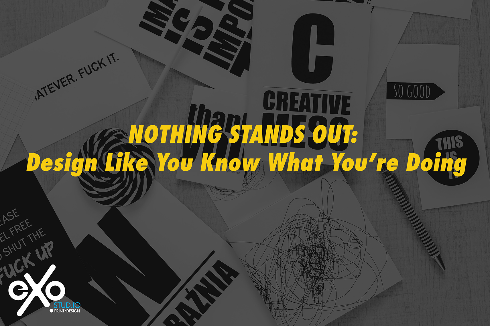
Ever seen a flyer where every line is in bold, all caps, underlined, and maybe even outlined in red?
It screams, but no one’s listening. That’s because if everything is loud, nothing has meaning.
Whether you’re designing a flyer, a banner, a product label, or your whole dang brand — the goal isn’t to shout. The goal is to communicate clearly. And if your design looks like a wall of visual noise, people will scroll right past it, confused or exhausted.
So let’s talk about why restraint is powerful, how hierarchy works, and how to finally design like you know what you’re doing — even if you’re not a designer (yet).
First: What Is Visual Hierarchy?
Visual hierarchy is how design guides your eye. It’s how you instinctively know what to read first, second, and last. Good hierarchy makes content feel effortless. Bad hierarchy makes people squint and guess.
Think of it like volume control.
You can have one thing at full blast — but not everything. Otherwise it’s just noise.
1. Bold Should Be a Tool — Not a Default
Yes, bold fonts are powerful. But if everything is bold, your design loses structure.
You need contrast:
-
Bold headers
-
Light subheaders
-
Standard weight body copy
If your sale sign, business name, and service list are all bold, how is anyone supposed to know what to focus on? They won’t. They’ll just check out.
Bold should say, “look here.” Not “look everywhere.”
2. White Space Is Not Wasted Space
When things are crammed edge-to-edge, the design feels frantic — like you’re yelling. But when you give your content room to breathe, it feels confident.
Empty space creates focus. It adds clarity. It tells the eye, “Pause here. Now look over there.”
Don’t be afraid of it — use it like punctuation.
3. Choose ONE Focal Point (Yes, Just One)
Every good design has one hero. It might be a headline, a product image, a quote, or a CTA. Everything else? It supports that.
If your banner has three different calls to action, four fonts, and a rainbow color palette, no one is going to know what you want them to do.
Before you design, ask:
✅ What’s the most important thing I want them to notice or do?
Then build around that one thing.
4. Stop Using Every Font You’ve Ever Downloaded
We’ve said it before, but it’s worth repeating: fonts have feelings.
Pairing more than 2–3 fonts in one design is like mixing three songs at once. It’s overwhelming.
-
Use one font for headlines
-
One for body text
-
And maybe a third accent if you really know what you’re doing
More than that, and it’s chaos.
️ 5. Design Should Lead — Not Compete With — Your Message
We’ve seen designs where the background fights the text. Where the icons compete with the CTA. Where the colors say “fun and fresh” but the business is a law firm.
That’s what happens when people decorate instead of design.
Your visuals should amplify your message, not distract from it.
Design like you’re directing traffic — not throwing a party in every corner of the canvas.
Why This Matters for Your Business
People make snap judgments based on how things look. It doesn’t matter if your business is amazing — if your visuals are confusing, chaotic, or unclear, you’ll get skipped.
When your design is clean, focused, and professional, people feel that. They trust it. They stick around. They take action.
That’s what we do at Exostud.io:
Design that actually helps your message land.
Print that turns heads, not just fills space.
And branding that feels like you.
✍️ In Summary
If you want people to take you seriously, start designing with intention — not desperation.
✅ Don’t bold everything
✅ Use space like a pro
✅ Give your design a focal point
✅ Limit your fonts
✅ Let your visuals support the message
Because if everything is loud, nothing is heard.
Need help creating scroll-stopping design that doesn’t scream “I made this in a panic”?
We’ve got you. Exostud.io builds print, branding, and visual identity that looks clean, confident, and clear — every time.