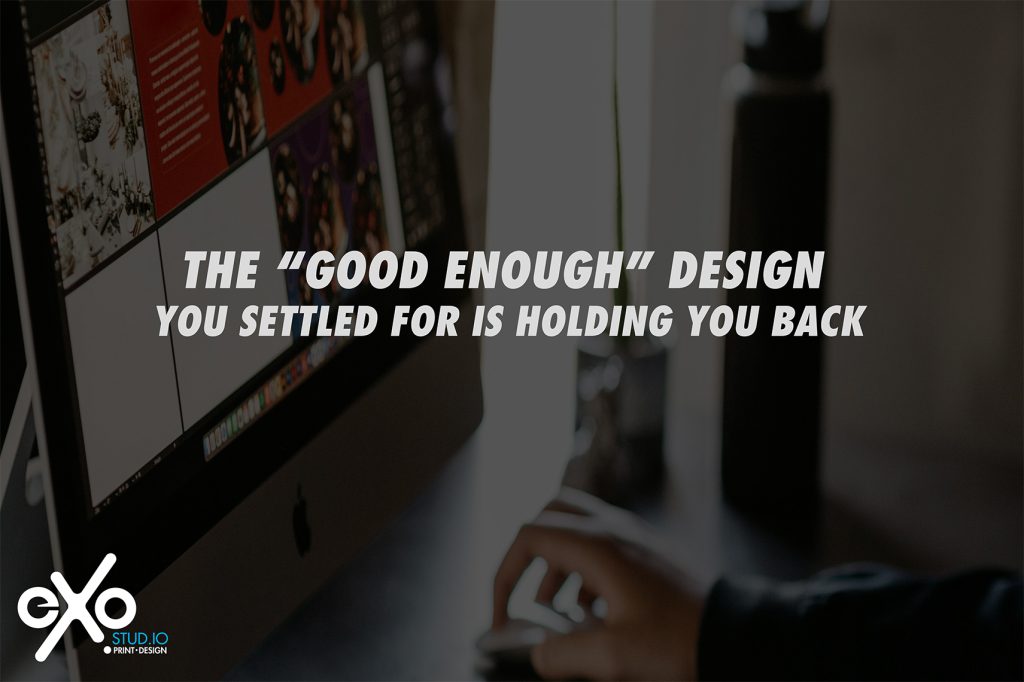


You’ve got a powerful story. An amazing product. Years of experience.
But let’s be real: most people never make it that far.
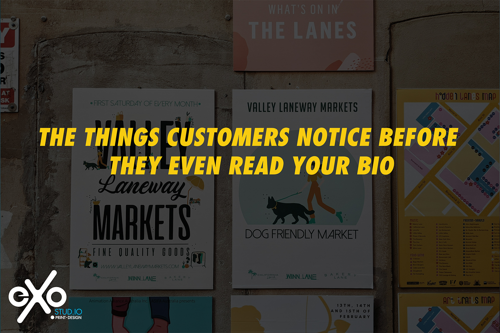
Before they even click your “About Me” or scroll to your captions, they’ve already made snap decisions — based on what they see.
That’s the thing about visual branding:
It speaks before you do.
So here’s what people are actually noticing — and judging — before they ever read a single word.
1. Your Logo (and Whether It’s Giving ‘Legit’ or ‘Last Minute’)
It doesn’t have to be fancy. But it does need to feel intentional.
A stretched-out, pixelated logo (or one made from a Canva template everyone’s seen before)? That sends the wrong message immediately.
First impressions count — and your logo is usually the handshake.
2. Your Color Palette
People associate color with vibe fast.
-
Neons? Bold and youthful.
-
Neutrals? Elevated and modern.
-
Random mish-mash of shades? Confusing and forgettable.
If your colors don’t align with your audience, they won’t connect — and they won’t stick around to read your backstory.
3. Your Fonts (Yes, Really)
Fonts are emotional.
They can look trustworthy, playful, luxurious, outdated — even desperate.
That script font you used to make your biz feel “fancy”? It might actually be hard to read and sending amateur signals.
Pro tip: Pick 2–3 fonts and use them consistently. Anything more gets messy fast.
4. Your Layout and Spacing
If your page or flyer is cluttered, crammed, or chaotic, people assume your business is too.
If it’s clean, well-spaced, and easy on the eyes? You feel trustworthy before you’ve said a word.
Design = perception. Messy layout = messy business.
5. Your Photos & Visual Content
Low-res product shots, awkward lighting, screenshots with crop marks — all of that reads as unprofessional.
Whether it’s you, your work, or your team:
-
Clean backgrounds
-
Natural lighting
-
Crisp, high-quality photos
That’s how you get taken seriously before they read your credentials.
️ 6. Your Website or Social Page Layout
If your links don’t work, your homepage looks dated, or your Instagram grid feels inconsistent, people bounce — quickly.
It doesn’t have to be perfect.
It does need to feel put together.
Your online presence is your storefront. Make sure it looks open for business.
7. Your Tagline or Headline
This is the first actual text people usually read — and they’re deciding whether to scroll or dip.
Your tagline should:
-
Be clear
-
Say what you do
-
Speak to your audience
If your first line is “Welcome to my page ” …you’re wasting valuable real estate.
8. Your Business Card or Print Materials
Still handing out cards that don’t match your vibe? Or worse — haven’t updated them in two years?
That little card is a physical first impression.
Make sure it feels like you now, not you in 2021.
9. Overall Consistency
If your website looks one way, your Instagram another, and your flyers a whole different mood?
It confuses people.
And confused people don’t convert.
They click off, unsubscribe, or scroll right past.
Consistency creates trust.
Even if your brand is simple, if it feels aligned — people stay.
Here’s the Bottom Line:
You don’t need perfect design.
But you do need visuals that:
✔ Match your brand vibe
✔ Show people what you’re about instantly
✔ Make them want to read more
At Exostud.io, we help small businesses go from “eh” to “elevated” — with custom design that actually means something.
Because your bio doesn’t matter…
if no one sticks around long enough to read it.